Lensbox
Client
Lensbox is a Vancouver-based eyecare technology company dedicated to modernizing the way patients access vision care and products. Founded by industry veterans and led by independent doctors of optometry, Lensbox bridges the gap between traditional brick-and-mortar clinics and the digital marketplace. The company provides an "omni-channel" experience that prioritizes patient health by keeping eyecare professionals (ECPs) at the center of the e-commerce journey.
Through strategic acquisitions (such as the eyewear brand Oxford & Kin) and partnerships with local pharmacies and manufacturers, Lensbox has expanded its reach across Canada and the United States. Its EyeDocs initiative further extends this reach by placing "bricks and clicks" experience centers in high-traffic locations like university campuses and family medicine practices, making professional eyecare more accessible to marginalized and remote communities.
"Our mission is to ensure eyecare services and e-commerce are delivered with the health and safety of patients in mind, while placing eyecare professionals back in the driver's seat." — Sanaz Sheila Bissonnette, CEO
Process
Lensbox was ready to transition from a disruptive startup to a category-defining Health-Tech leader. The rebrand must move away from looking like a standard e-commerce shop and instead position itself as a sophisticated bridge between professional medical expertise and modern digital convenience.
Humanized Tech: Soften the "box" in Lensbox. While the platform is high-tech, the benefit is high-touch care.
Unified Trust: Create a visual language that feels "medical enough" for doctors to trust, but "lifestyle enough" for consumers to love.
Clarified Value Prop: Explicitly communicate that this isn't just a shop—it’s a doctor-backed ecosystem.
Project
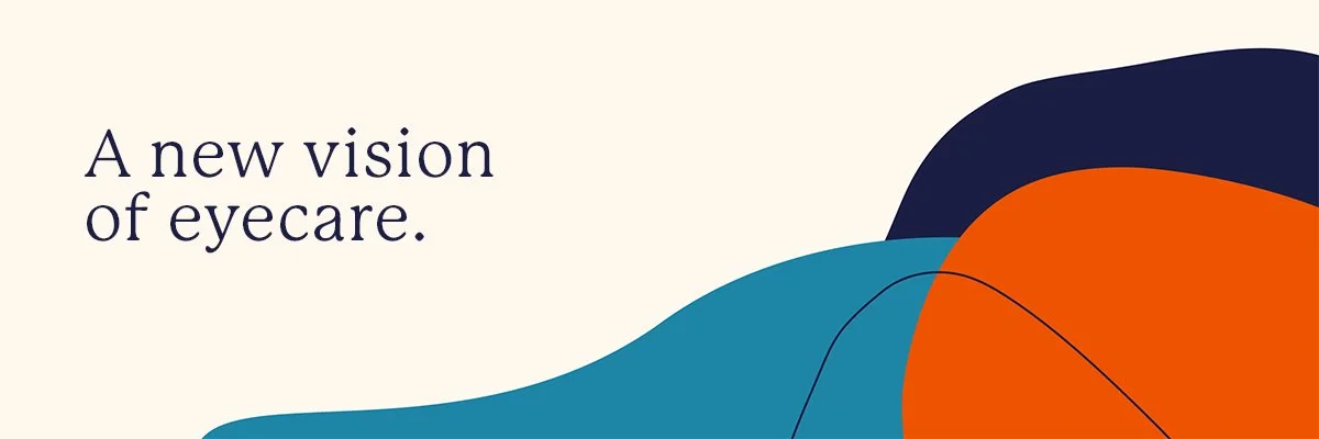
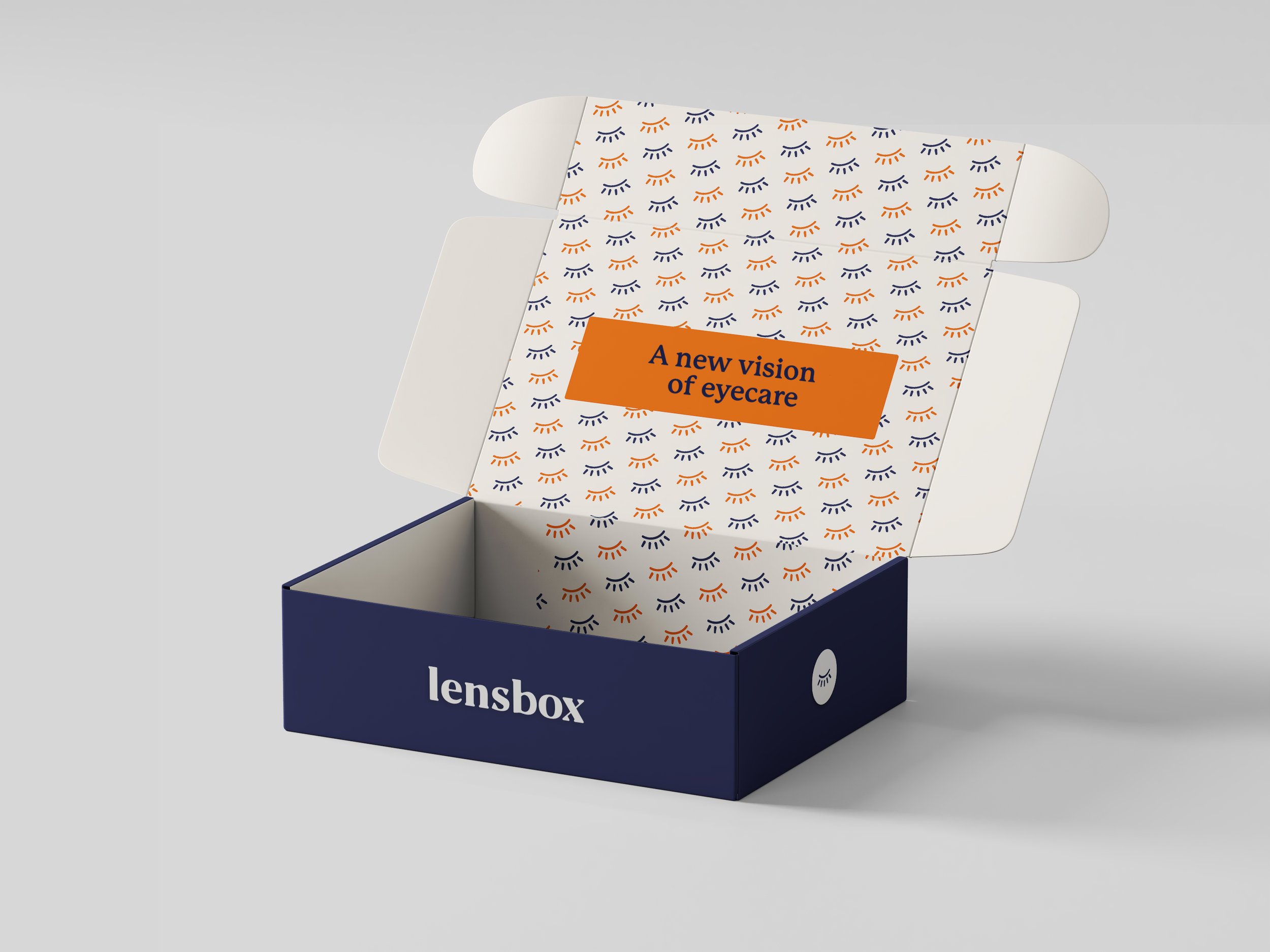
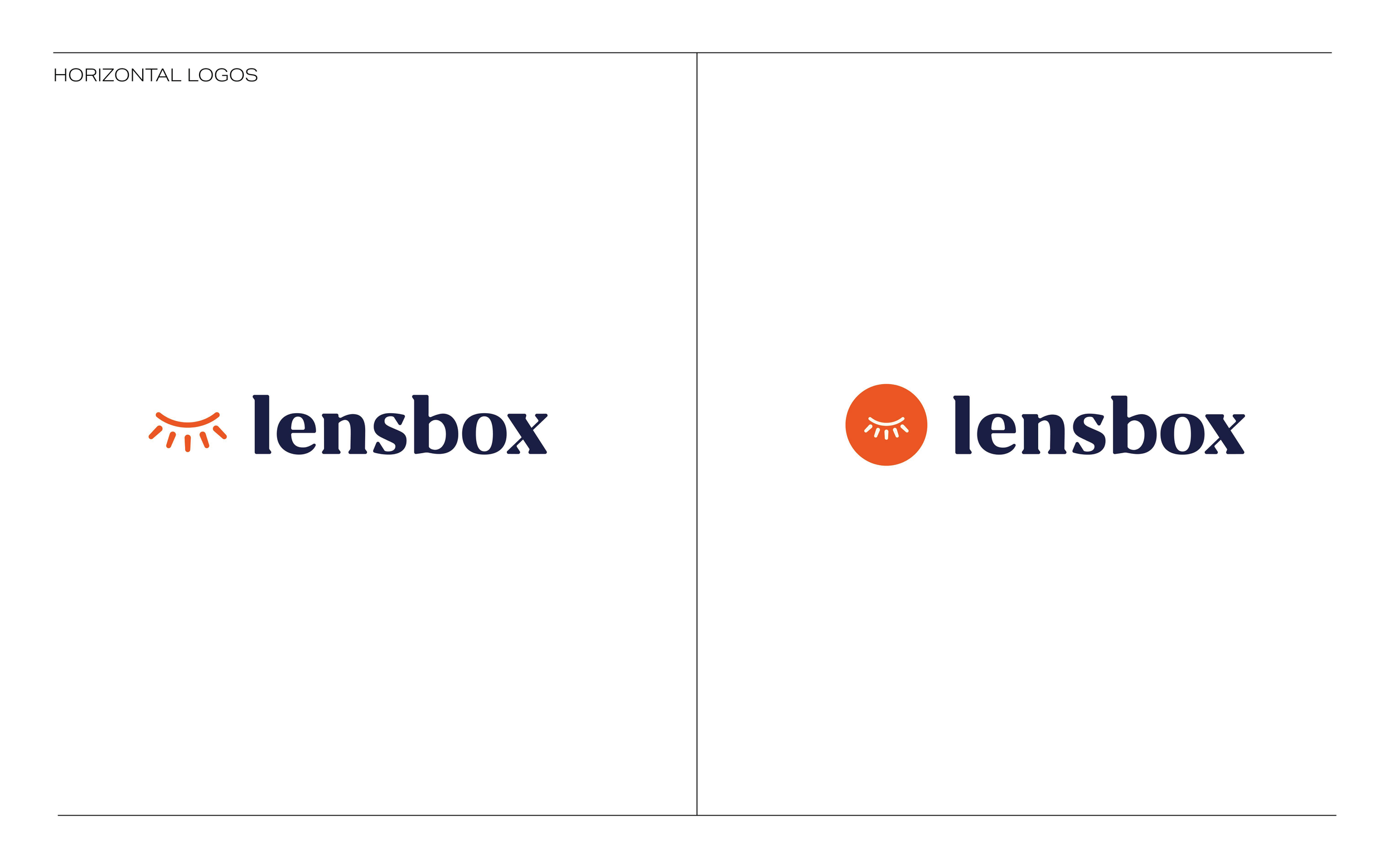
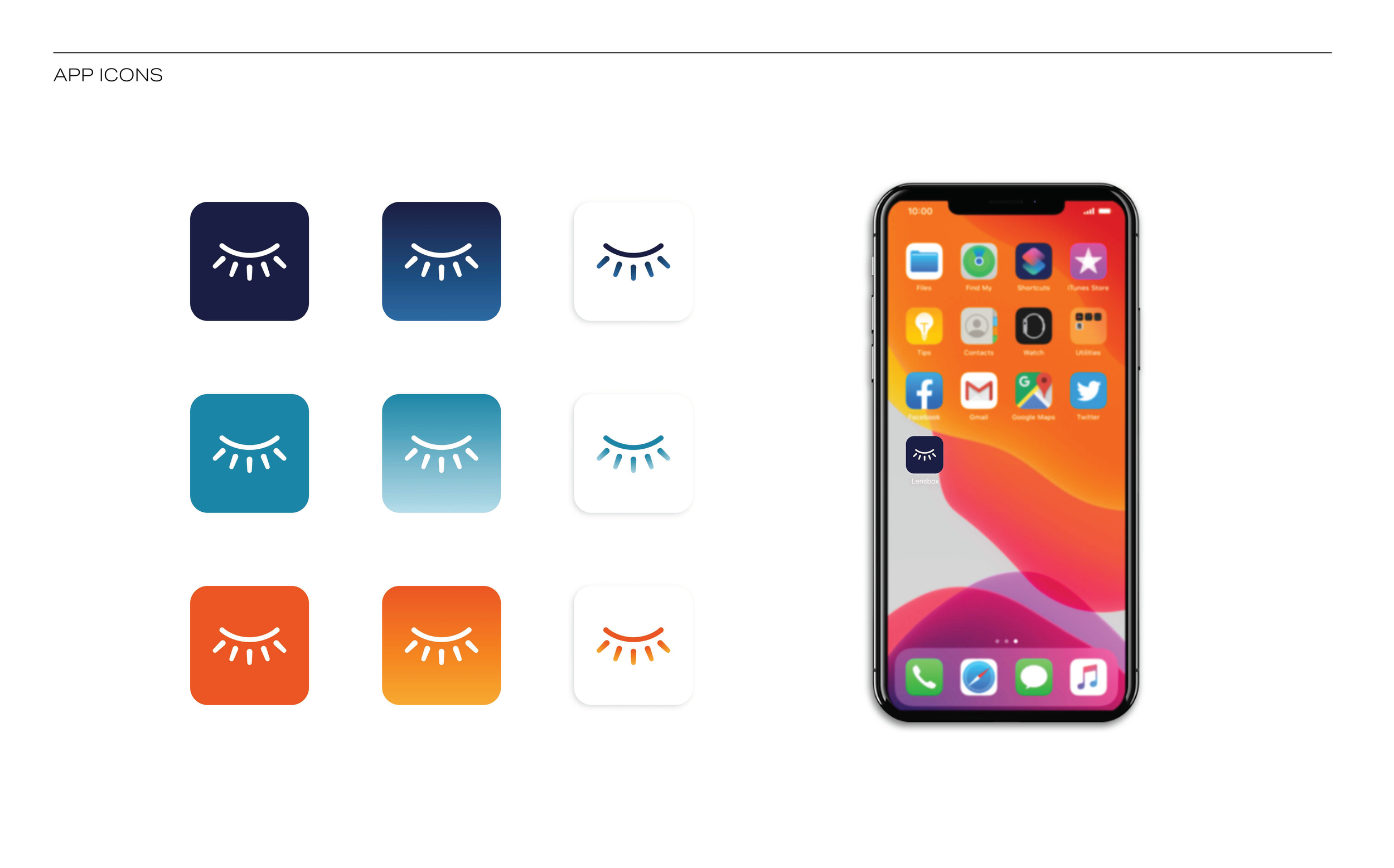
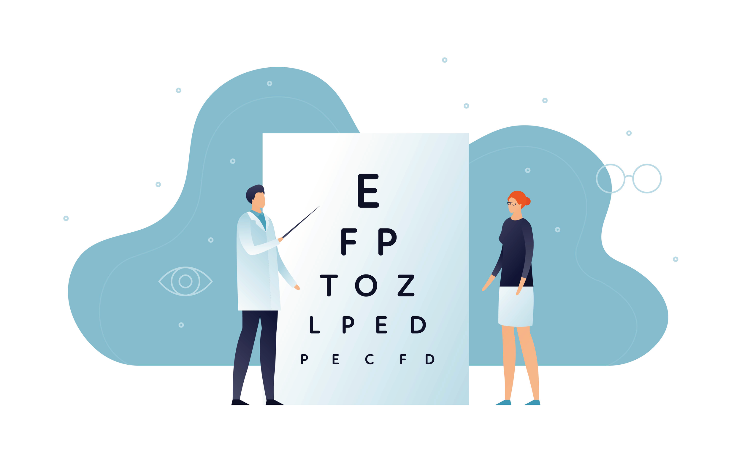
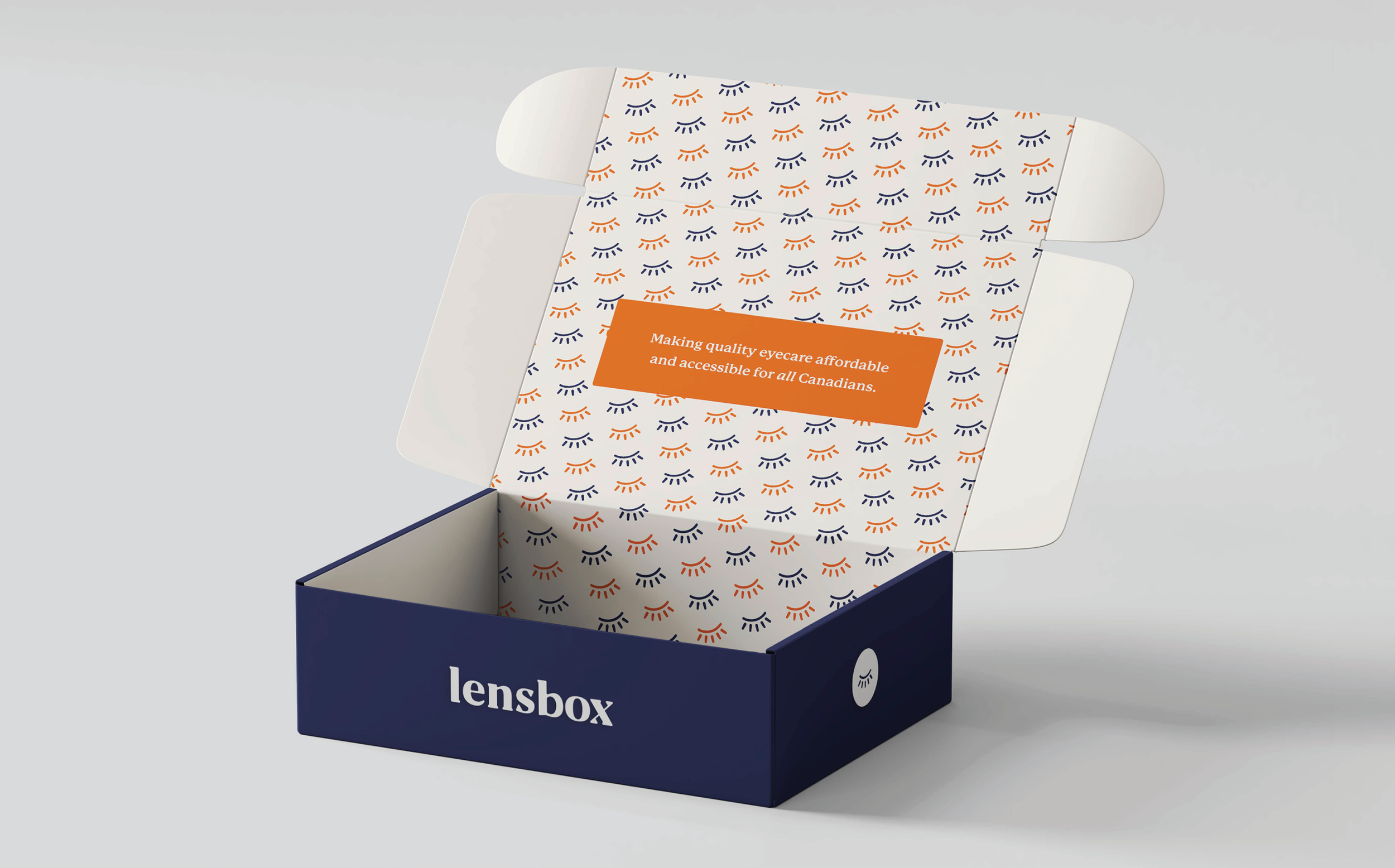
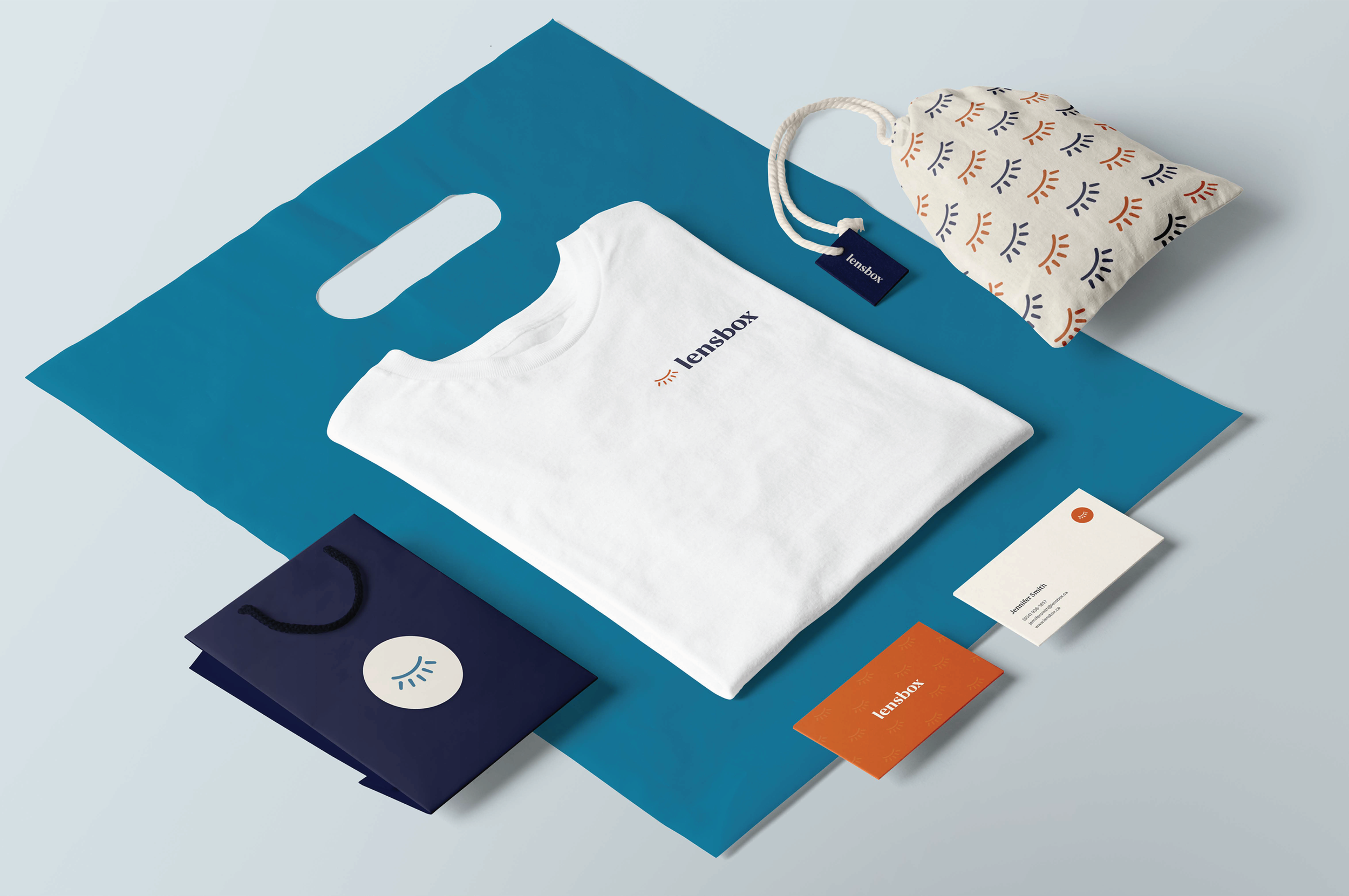
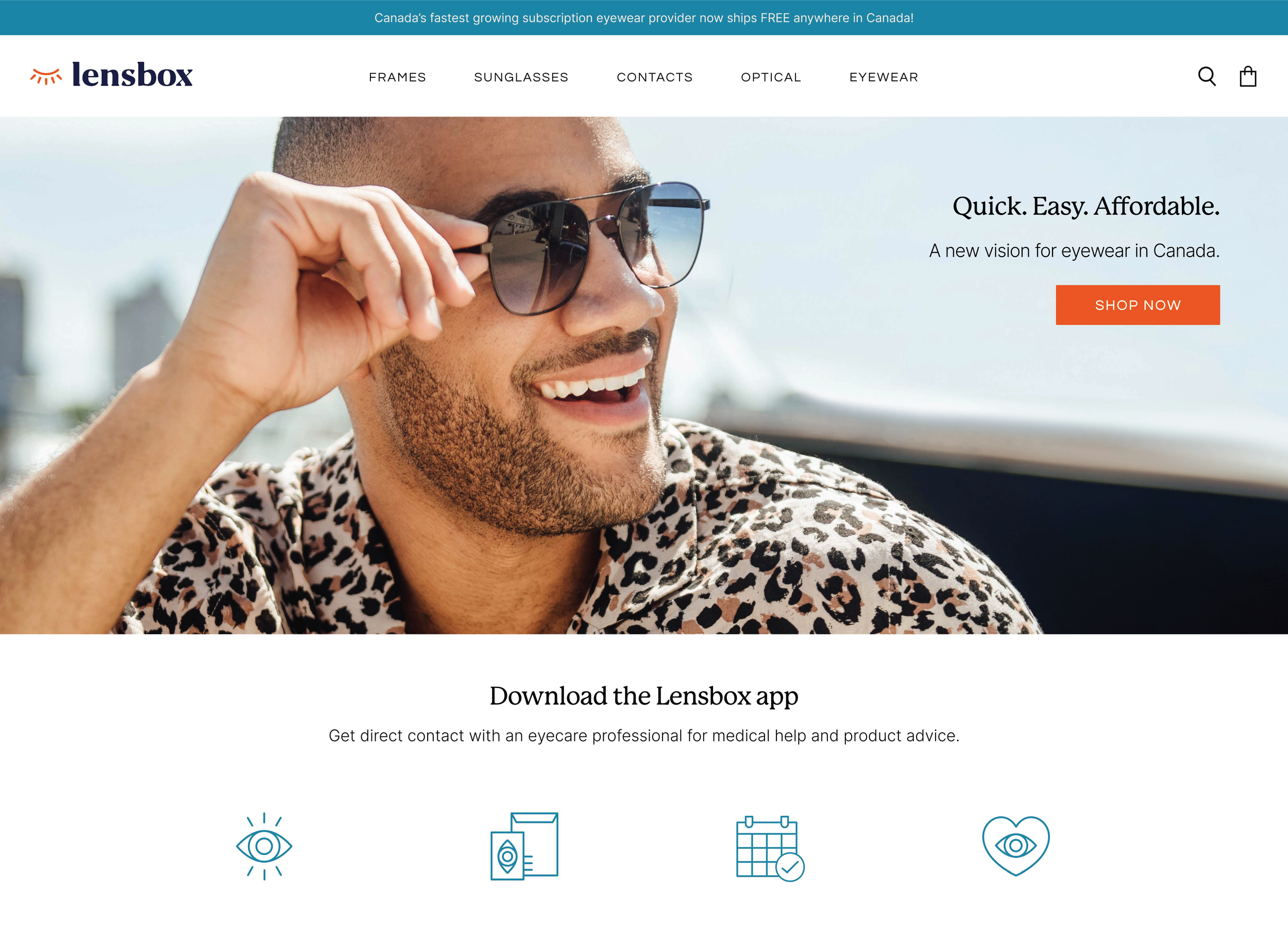
The new visual identity moved away from generic medical blue to a deep navy to convey trust, crisp whites for clarity, and an accent of "optic teal" or "warm sand" for a modern, lifestyle feel. The typography paired a clean, high-legibility sans-serif with a sophisticated serif for headers, creating a "boutique clinic" vibe. The logo avoided literal boxes and instead used symbols that subtly nod to the partnership between eye care professionals (ECPs) and patients by representing focus, connection, and the iris.
Success was measured by increased ECP sign-up and onboarding rates, higher patient retention through a shift to a subscription model, and a brand perception change from an "online store" to an "integrated health platform."