Rare Disease Foundation
Client
The Rare Disease Foundation (RDF) was founded in Vancouver, British Columbia in February 2008. RDF was launched by rare disease patients, caregivers, researchers, and practitioners who shared the same sense of urgency and values about access to resources and research for rare disease patients and their families. Today, the foundation serves a global community with research funding, resources and community programs.
The Rare Disease Foundation’s mission is to transform the lives of Canadians and global citizens living with a rare disease by revolutionizing awareness, developing innovative cures through its research programs, and providing resources through community and clinical support channels.
Process
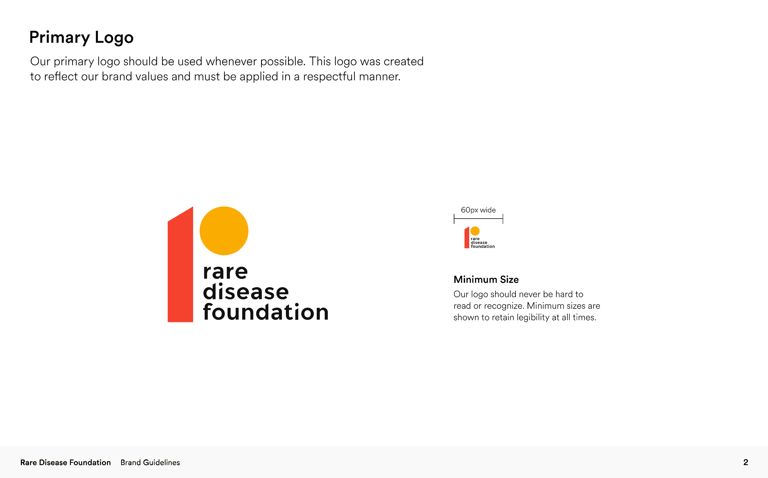
Building a brand for an organization that dealt with the complexities of rare diseases required more than just a nice logo.
We wanted to build an architecture of empathy and efficiency that would translate the RDF’ core values into a collaborative branding strategy that clarified its voice and vision. We didn't develop this in a vacuum. By interviewing your internal teams and external community members, we ensured the new brand wasn't a "mask" but a mirror of the RDF’s actual impact.
Honoring its holistic approach and diverse community needs, we couldn’t look at "customers." We instead needed to investigate an ecosystem of stakeholders: researchers, patients, families, and practitioners to find the common threads between them. We realized that while their languages differ (clinical vs. personal), their priorities were the same: empathy and action. Instead of describing problems, the RDF would be facilitating solutions.
Project
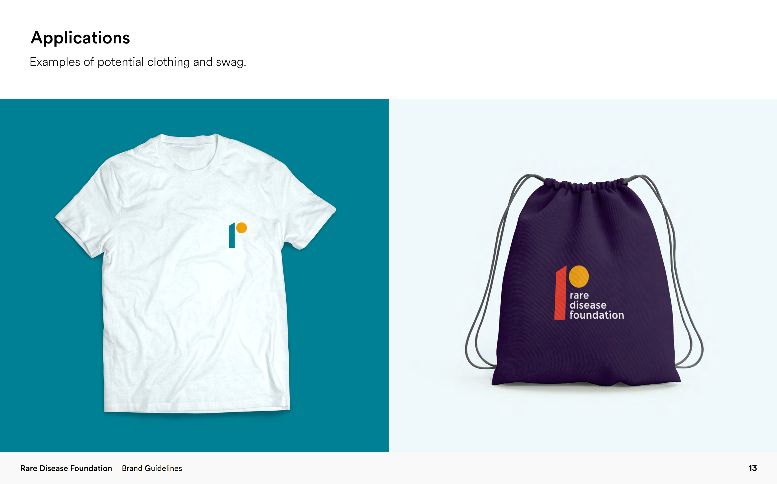
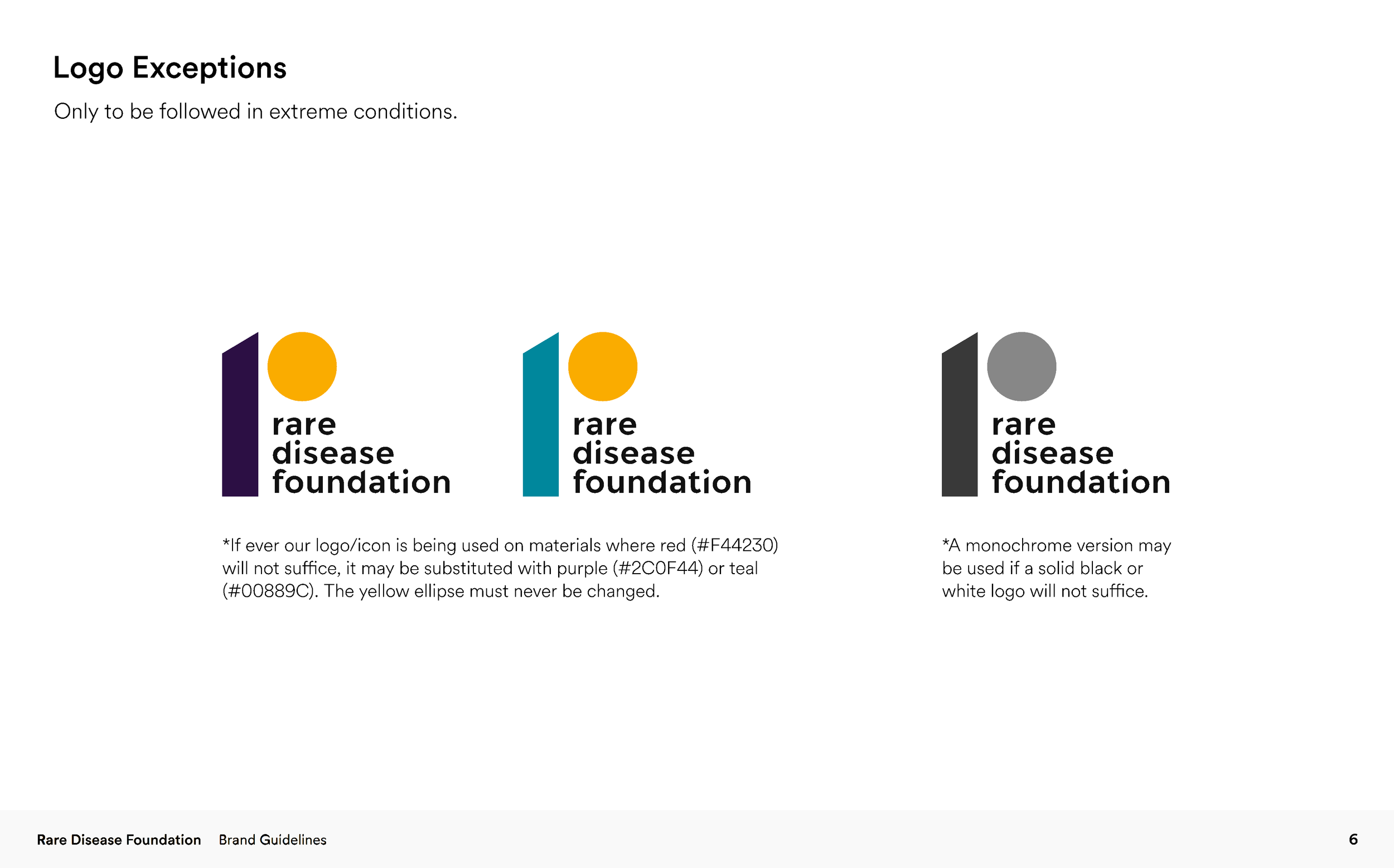
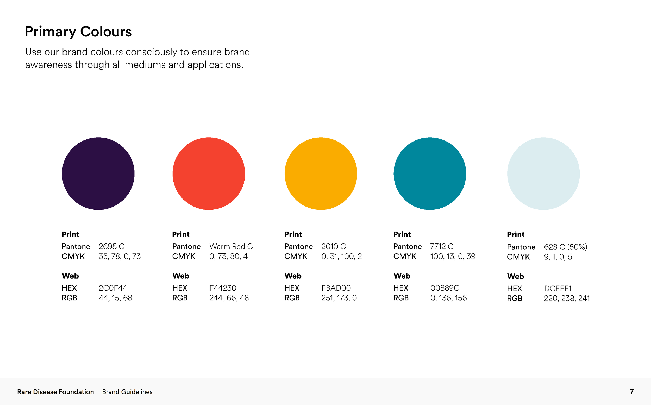
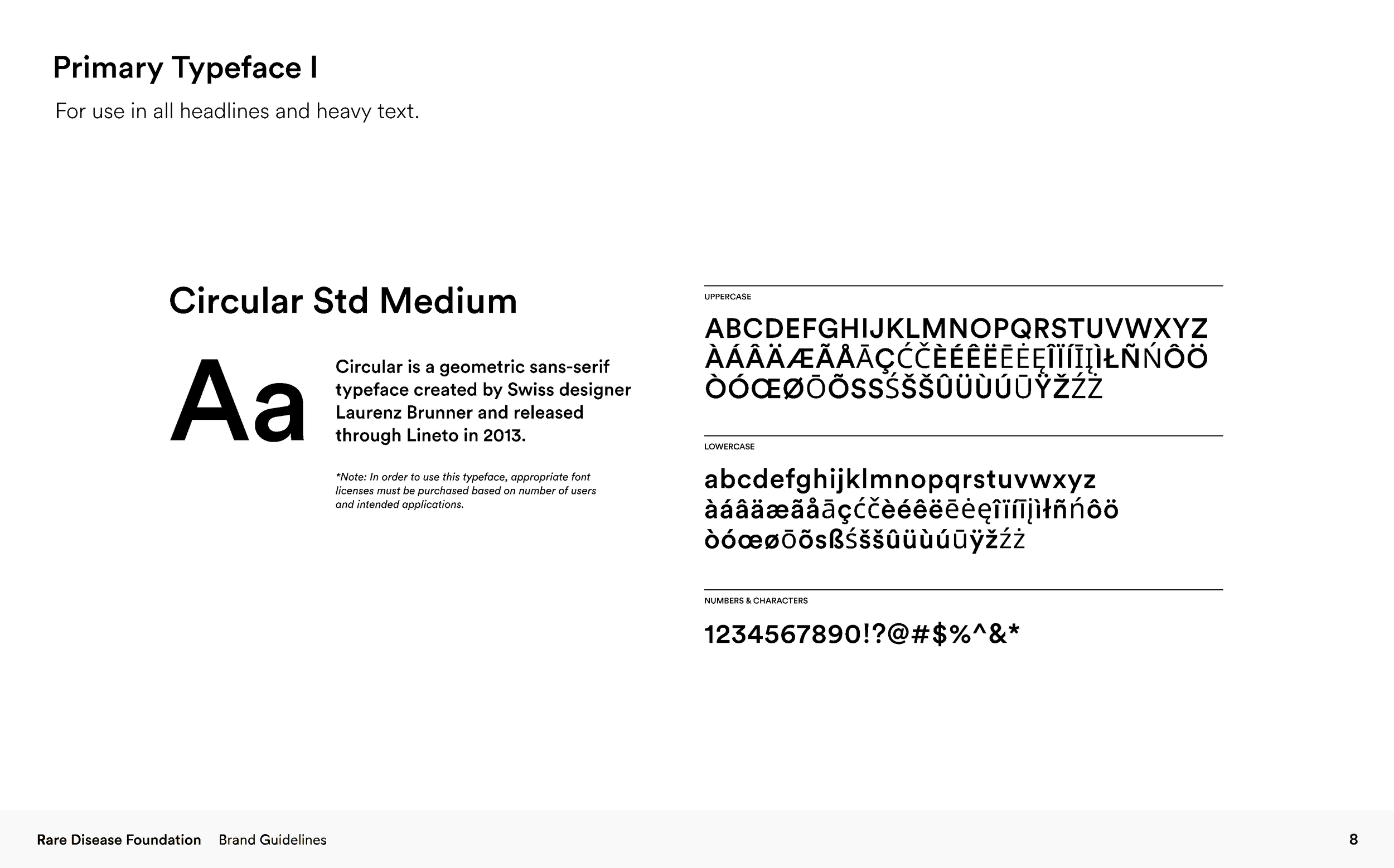
We translated the RDF’s operational values into visual benchmarks. Our goal was to create a brand that felt as "seed-capital fast" as your funding model.
Clean, modern typography and "momentum-based" graphic elements that suggest speed and progress.
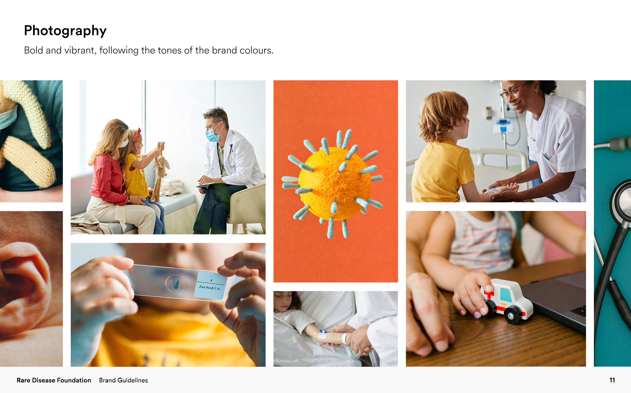
A palette that balances professional credibility with warmth, using photography that highlights the agency of patients.
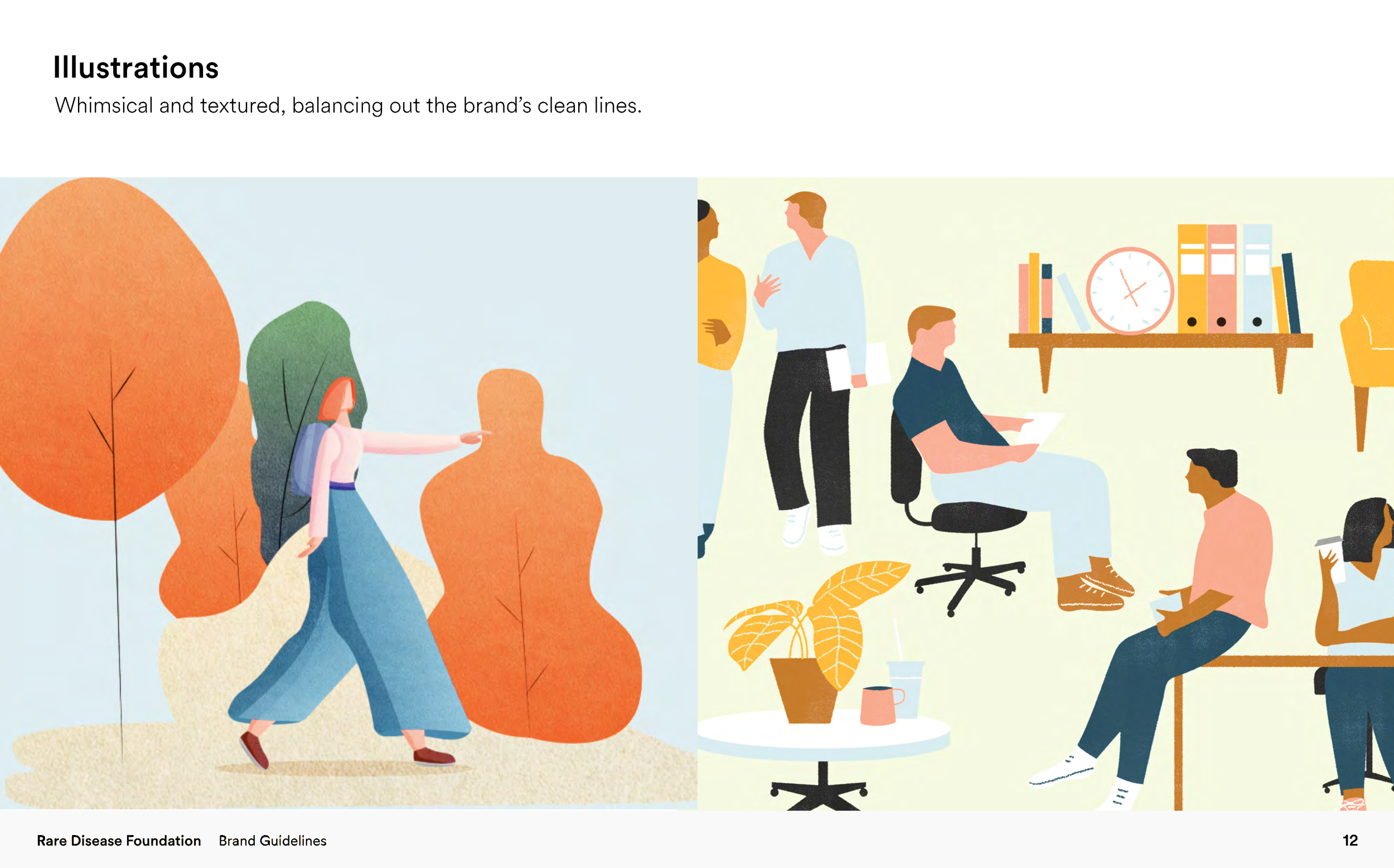
A modular design system that works across different languages and digital platforms without losing its core identity.
How should a stakeholder feel when they encounter the Rare Disease Foundation in the market? We designed the brand to evoke three specific feelings:
Empowered (The Patient/Caregiver): A sense that they aren't just recipients of care, but active decision-makers. The brand feels like a platform they own.
Confident (The Researcher): A sense of professional rigor. The visual identity signals that the foundation is a serious, sophisticated partner capable of managing high-level R&D.
Urgency (The Donor): A feeling that their contribution won't be caught in red tape. The "Shovel-Ready" nature of your work is reflected in a brand that feels lean, active, and ready to move.